USER INTERVIEWS / USER PERSONAS / SKETCHING & WIRE-FRAMING / PROTOTYPING / UX/UI DESIGN / USABILITY TESTING / VISUAL QA
Role: Lead Product Designer Teams: Product, CX, Engineering, QA, Sales
Overview
From Calendar to Road: Simplifying How Busy Sales Reps Start Their Day
Our app is a leading field sales enablement platform designed to enhance the productivity and effectiveness of outside sales teams. Tailored for industries such as solar, telecommunications, home improvement, and medical sales, it offers a comprehensive suite of tools that streamline sales operations and provide real-time insights.
Key features include automated activity tracking, route optimization, territory management, and seamless CRM integration. Its mobile-friendly interface allows sales representatives to log visits, calls, texts, and emails effortlessly, ensuring that data is captured accurately and promptly. Managers benefit from real-time visibility into field activities, enabling them to make informed decisions and provide timely support to their teams.
Problem
Our Sales Rep users needed a faster, clearer way to execute what was already on their calendar.
Feedback from in-app sentiment prompts and support conversations pointed to a common pain: reps were losing time manually building routes from their scheduled activities. What should’ve been a streamlined process was filled with extra steps and uncertainty.
As a Lead Product Designer, I led a team of designers through a multi-phase effort to reimagine routing—making it easier to act on scheduled plans, understand route status at a glance, and add valuable nearby stops. We grounded our work in real user behavior and designed enhancements that felt natural in the daily flow of fieldwork—where time, clarity, and momentum are everything.
Previous UX
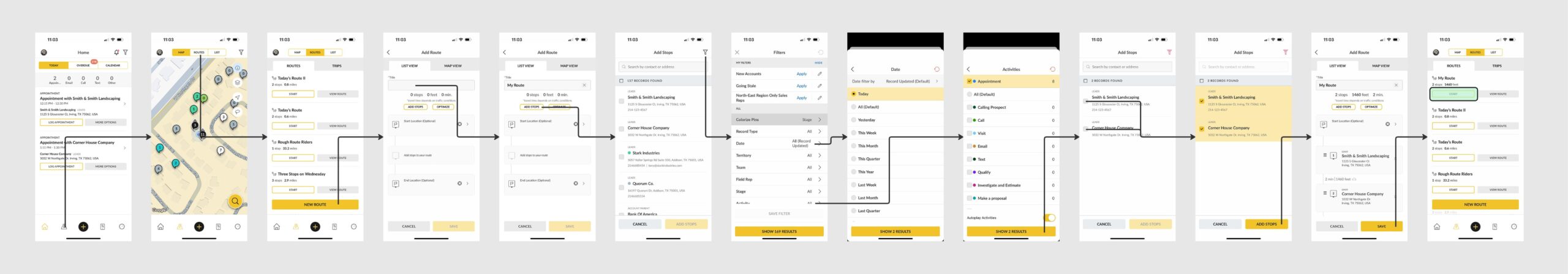
Below is the original experience users had to go through just to add records with scheduled activities to a route. The flow totaled 13 separate steps—before the route even began. It was slow, confusing, and far from intuitive for reps who needed to move quickly.
Previously users had to go through 13-step flow to route scheduled appointments
Design Thinking in Action
I kicked off the project by framing the challenge clearly to the team: reps needed a faster way to act on what was already planned in their calendars. This wasn’t just a usability issue—it was a daily productivity gap impacting both user satisfaction and business efficiency.
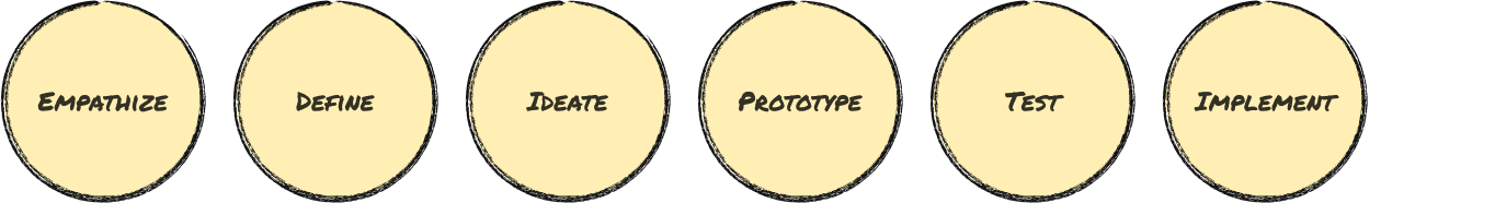
To guide our approach, I leaned into the Design Thinking process:
I walked the team through each phase, connecting the strategy to the real-world impact we aimed to make: reduce friction, restore momentum, and help reps move through their day with confidence.
By anchoring our work in user needs and business outcomes, we created shared clarity and purpose—making it easier to prioritize, collaborate, and deliver meaningful results.
Empathize
Routing feedback came in from multiple sources—support tickets, sentiment popups, and product analytics—but we needed to dig deeper to understand the why behind the friction.
User Interviews
I directed the team to conduct screen-sharing sessions with field reps, observing how they built routes, added stops, and used their calendars. Rather than steering the conversations, we focused on identifying patterns of hesitation, workarounds, and inefficiencies.
Field Study
To bring firsthand perspective into the room, I traveled to Indianapolis and shadowed a rep for a full day. Observing how routing unfolded in real time—between appointments, in traffic, under real-world pressures—helped ground our thinking in authentic user behavior that goes beyond remote sessions.
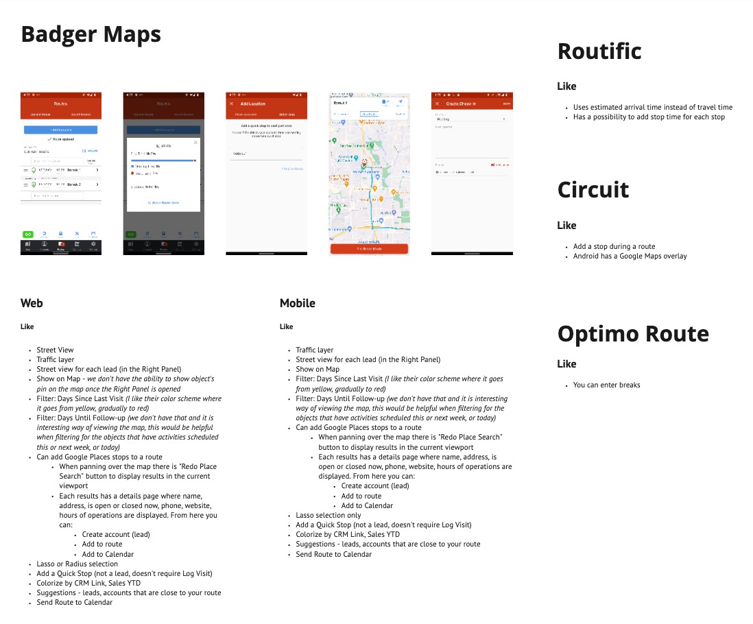
Qualitative Surveys & Competitive Insights
We distributed targeted surveys to our heaviest routing users, asking open-ended questions about their planning process, pain points, and what ideal routing looked like.
In parallel, we benchmarked against competing platforms, noting both user feedback and design patterns worth learning from—or improving on.
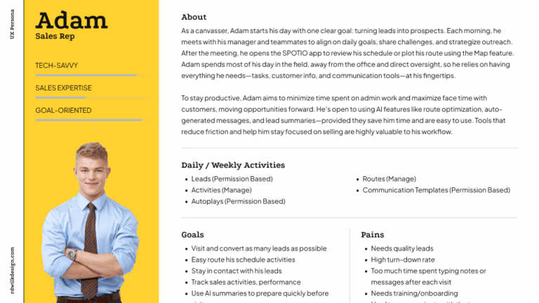
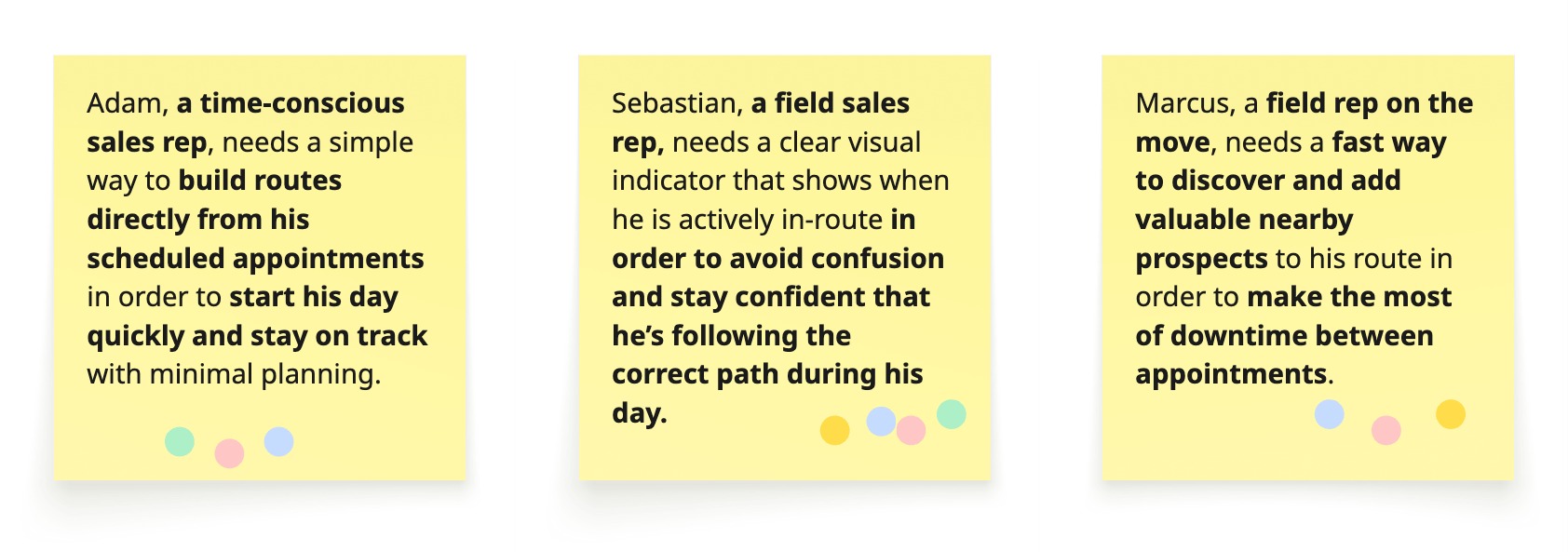
Personas
Together with the team, we refined our Sales Rep persona—our primary focus for this project, since they’re the ones actively executing the routes. This persona helped us step into the rep’s day-to-day reality: starting early, juggling meetings, navigating unfamiliar areas, and racing against time.
By clearly defining their goals, frustrations, and habits, we ensured that every design decision was grounded in what actually mattered to them—not just what seemed logical from a product perspective.
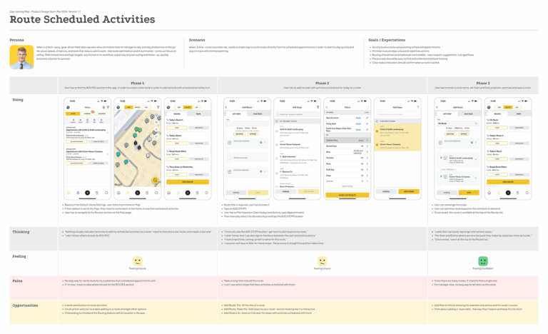
Journey Mapping
To visualize the end-to-end experience, we created a detailed Customer Journey Map focused on how sales reps interact with routing throughout their day.
This artifact revealed critical breakdowns in the flow: many users didn’t know how to add scheduled activities to a route, and those who did found the process unnecessarily long and tedious.
We also uncovered that users were often unsure whether they were actively in a route, leading to confusion and missed steps.
Additionally, the task of adding more records mid-route surfaced as a major pain point—slow, unintuitive, and disruptive to their workflow. These insights helped us pinpoint where clarity, automation, and streamlined actions could make the biggest impact, shaping our design priorities moving forward.
User Journey Map for routing scheduled activities
Define
With insights in hand, I led the team in translating what we heard from users into focused design opportunities. This phase was about turning research into action—clarifying the problems before exploring solutions.
User Need Statement
Together, we distilled key findings into concise, actionable need statements. I facilitated working sessions where we mapped each pain point to a clear user goal, using structured language to ensure alignment across Product and Design.
These statements became foundational—anchoring our decisions and helping us prioritize features that delivered both user value and business impact.
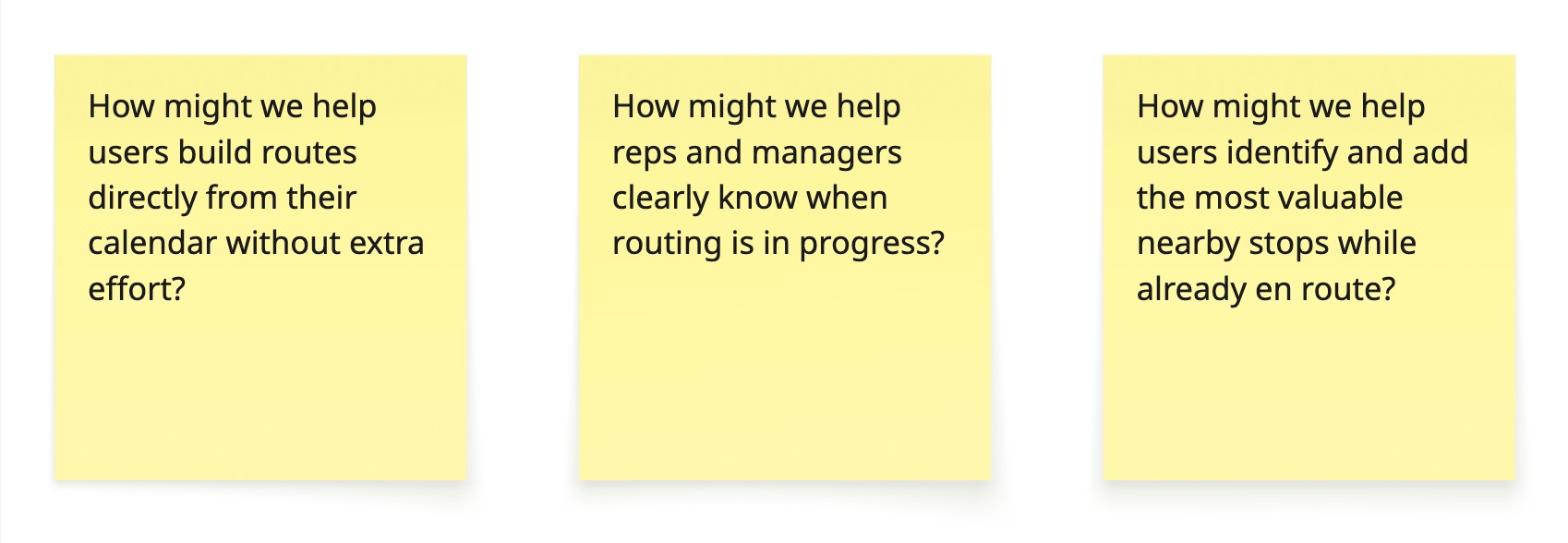
Scenarios & “How Might We”
To prepare for ideation, I guided the team through crafting real-world scenarios and reframing user problems into “How Might We” prompts. These allowed us to approach challenges with creativity and clarity.
We developed scenario narratives rooted in each persona’s day-to-day challenges. For example:
Scenario 1: Calendar-Based Routing Made Easy
Persona: Adam, Organized Sales Rep
Context: Adam starts his day by checking his calendar, which includes a mix of confirmed appointments and internal planning time.
Situation: He wants to build a route from the day’s scheduled activities but finds it tedious to toggle between his calendar and the routing tool.
Frustration: He wastes time trying to match appointments with addresses manually, unsure which stops should be prioritized.
To turn defined problems into actionable design opportunities, we reframed key insights and these scenarios using the “How Might We” technique – transforming challenges into open-ended prompts for exploration.
This phase aligned the team on what mattered most—and gave us a confident launch point for creative exploration.
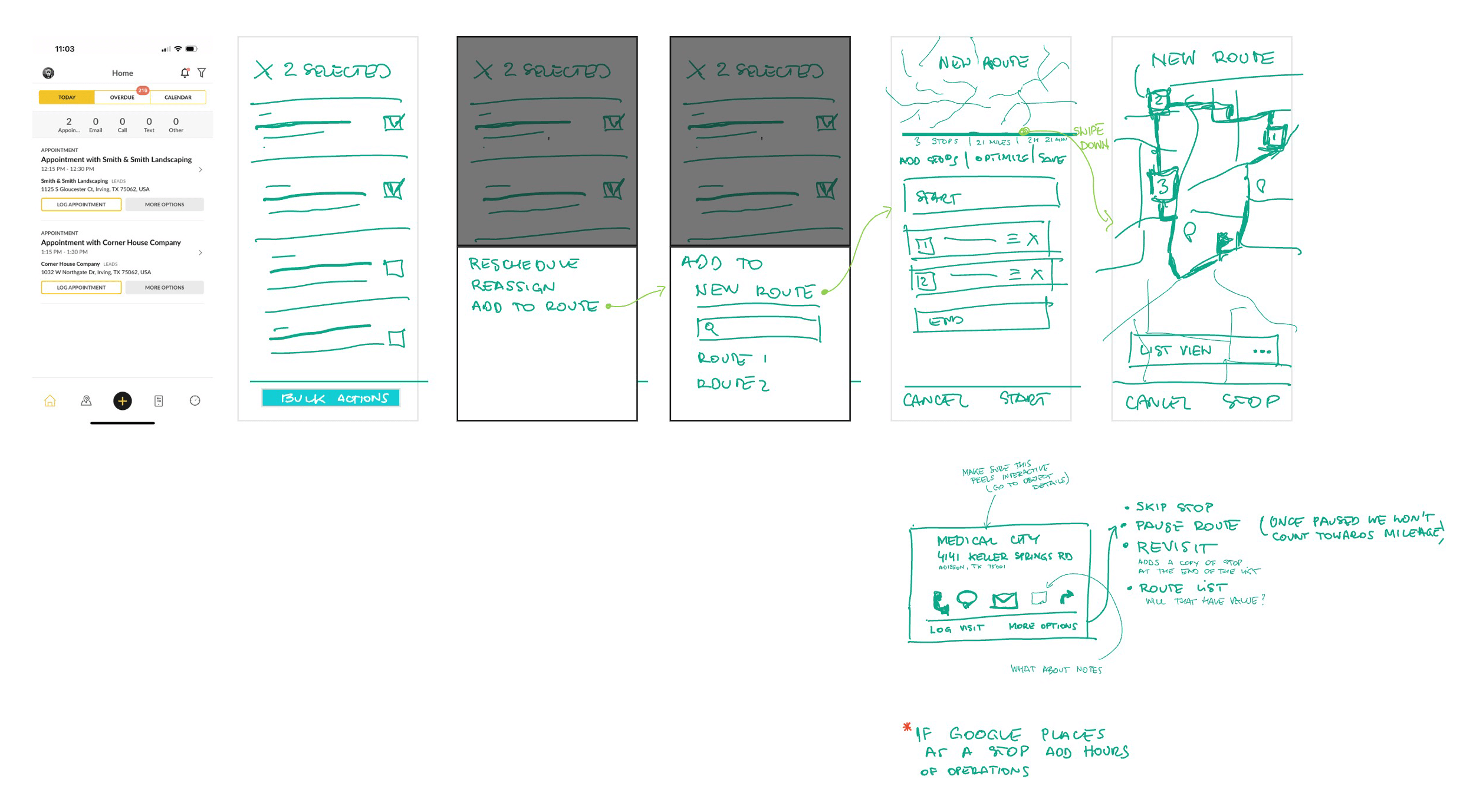
Ideate
With clear goals established, I facilitated collaborative ideation sessions in Miro and FigJam. We annotated existing screens, explored new possibilities, and encouraged cross-functional input.
Instead of designing from scratch, I focused on evolving the existing interface—layering improvements into the flow reps were already familiar with.
Together, we generated three key implementation ideas:
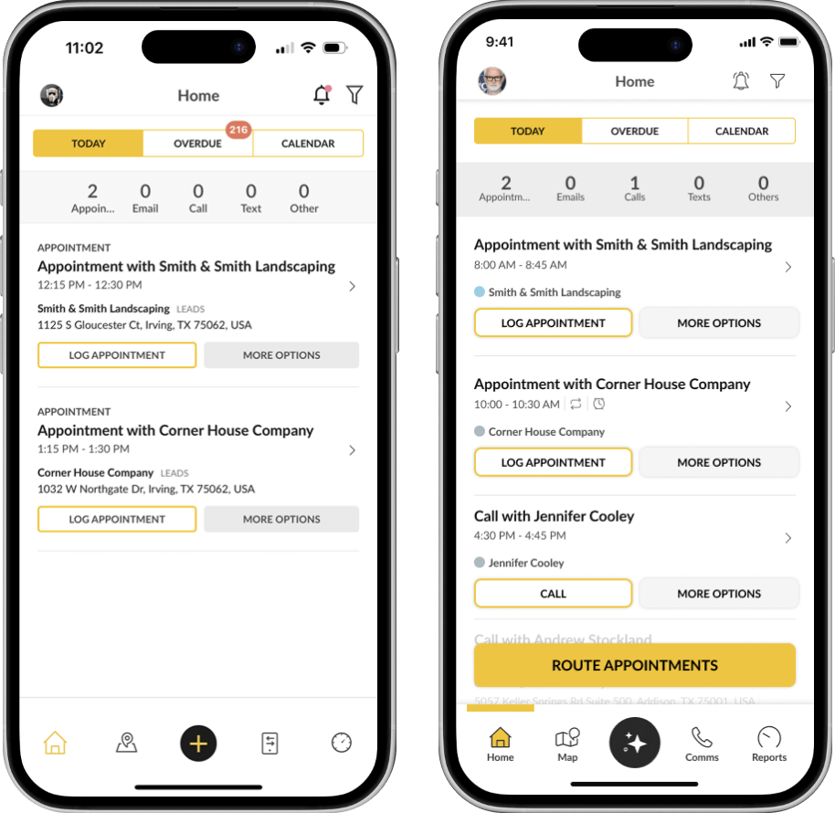
A dedicated button to route activities
A persistent banner indicating an active route, visible across the interface – not just on the Map page
Displaying additional records on the map during a route, with prioritization and the option to add them as stops
Each of these directly addressed pain points uncovered during the Empathize phase, giving us confidence that we were moving toward effective, user-centered solutions.
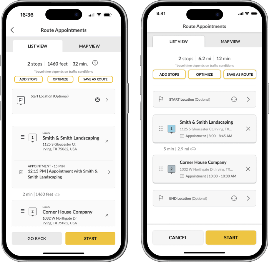
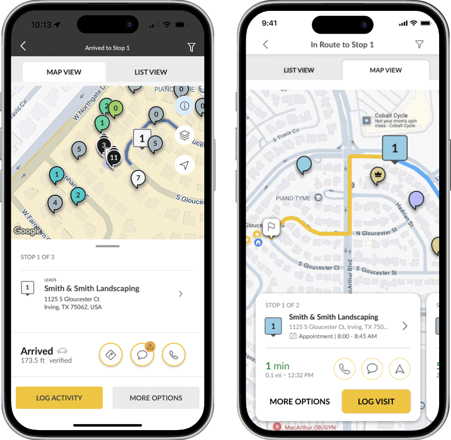
Prototype
Once we landed on the most promising concepts, I transitioned to high-fidelity Figma prototypes using our shared design system’s component library. This allowed for rapid iteration while staying faithful to our live UI.
The prototype below represents the ideas we identified earlier.
Test
I ran moderated remote usability tests with the same reps I interviewed earlier. I observed how they:
Routed directly from scheduled activities
Recognized active routing status
Discovered and added valuable nearby stops mid-route
These sessions revealed subtle friction—timing of prompts, unclear icons, edge cases like multi-day trips—which we quickly addressed through design tweaks and microcopy refinements.
Implement
After validation, I led a full Visual QA pass across web and mobile. This meant reviewing live builds against Figma specs and flagging any deviations in:
Layout hierarchy and component behavior
Cross-platform consistency
Visual and functional clarity of new routing indicators
I worked closely with developers to resolve issues before launch, ensuring the final product stayed true to intent.
Additionally, we updated the styling of several elements to give the app a more polished look. This involved redesigning components in Figma, updating the design system, and syncing the changes in Storybook.
Below are some examples of these UI improvements.
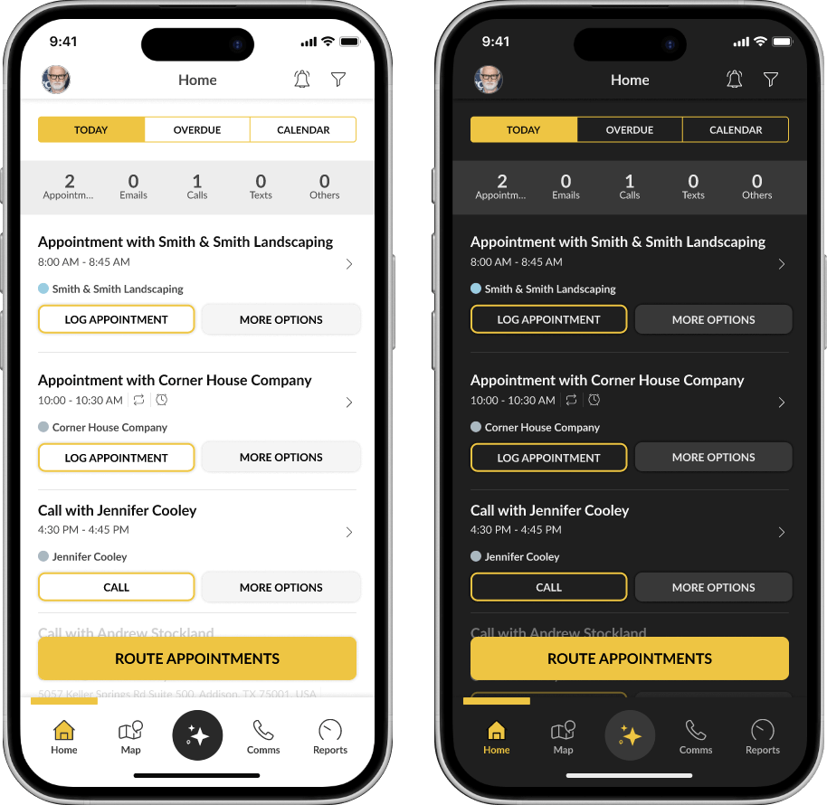
Home: New header with elevation, shorter activity cards, new ROUTE APPOINTMENTS button, new bottom navigation
Route Details: Elevation for header, tabs, new stop cards, new bottom buttons
In Route: new header, tabs with elevation, new stop cards
Light and Dark modes
Challenges & Learnings
Redesigning routing meant dealing with complex variables—location accuracy, driving conditions, user habits. I learned to:
Work within familiar patterns instead of reinventing workflows
Prioritize clarity in feedback and controls
Design for unpredictable real-world moments, not ideal flows
Final Reflection
Routing may seem simple on the surface, but for reps in the field, it’s everything. By listening deeply, designing thoughtfully, and testing rigorously, we turned routing into something smarter, faster, and more human.