Role: Design System Lead Teams: Product, Engineering, QA
Creating Consistency & Efficiency
A scalable design system forms the backbone of a consistent, efficient user experience. By standardizing components, styles, and interaction patterns, it speeds up delivery, reduces duplication, and enables seamless collaboration between design and development. This initiative was built with scalability, brand consistency, and developer efficiency at its core.
Project Overview
I led the end-to-end creation of a company-wide Design System—from auditing legacy UI patterns to full integration with code via Storybook. This system introduced a unified visual language and significantly improved speed, scalability, and cross-team alignment.
The Challenge
Before implementing the Design System, the company faced several UX/UI challenges:
Visual inconsistencies across Web and Mobile platforms
Lack of documentation, creating delays in handoffs
Brand fragmentation due to unmanaged growth
My Role
As a Design System Lead, I was responsible for:
Researching and defining the foundational principles of the Design System.
Designing scalable UI components, patterns, and guidelines.
Collaborating with developers to ensure smooth implementation.
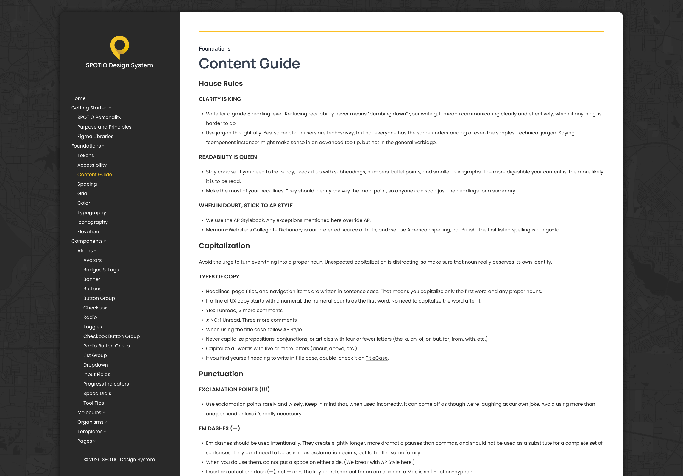
Creating detailed documentation for designers and developers.
Driving adoption through stakeholder alignment, workshops, and hands-on onboarding.
Process & Approach
Research & Analysis
I audited existing UI patterns and workflows, identified inconsistencies, and gathered pain points from developers and stakeholders to inform the system’s structure.
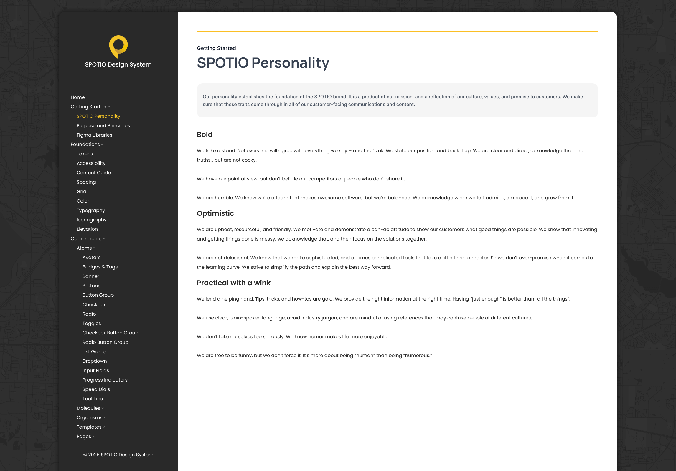
Defining Core Principles
To ensure the Design System aligned with the company’s brand and product goals, I established core principles, including:
Scalability – Designed components to support long-term product evolution.
Accessibility – Built for WCAG compliance from the ground up.
Consistency – Unified design patterns across all platforms.
Efficiency – Streamlined design-dev workflows and reduced redundancy.
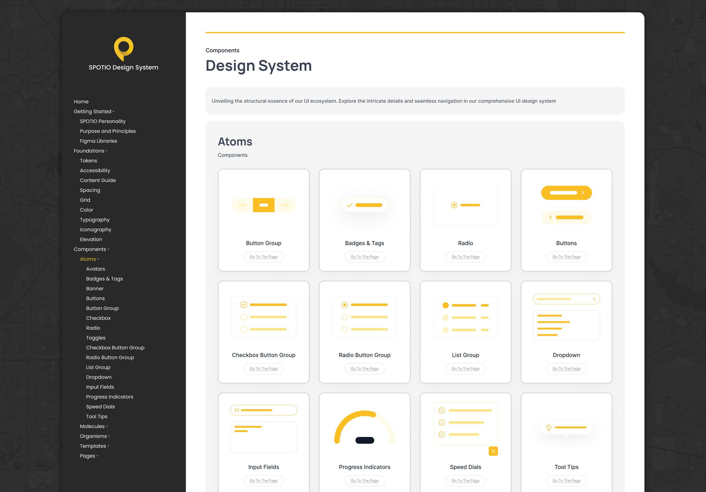
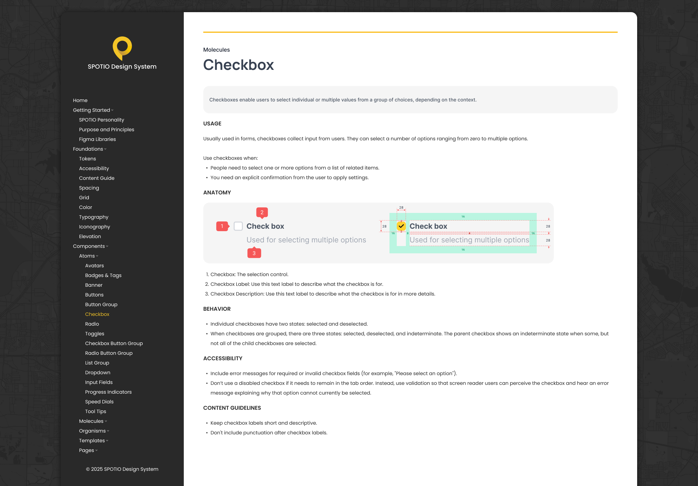
Component Library & Guidelines
I designed a robust component library, including:
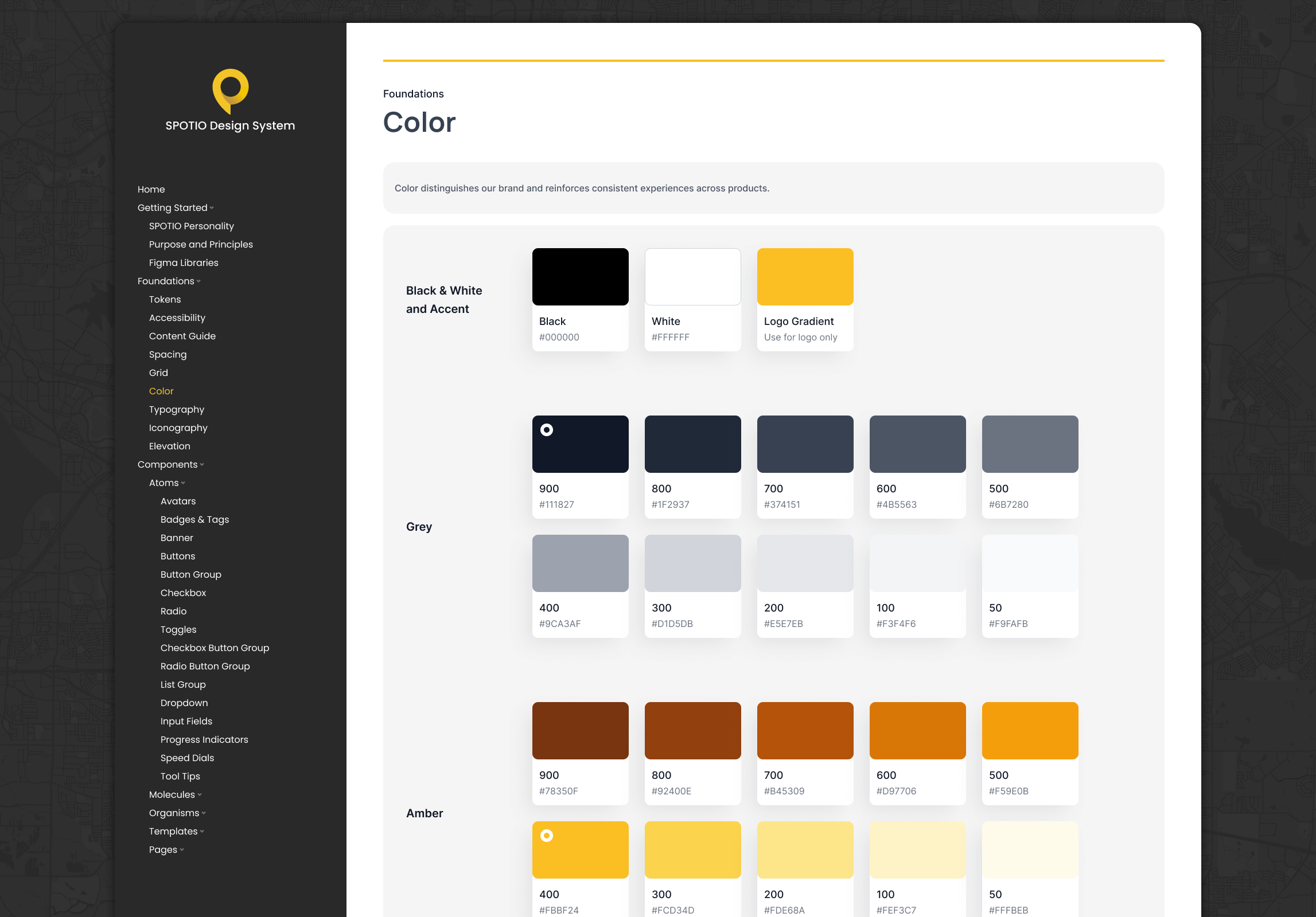
Typography, Color Palette, and Iconography
Buttons, Forms, Cards, Modals, and Navigation Patterns
Spacing, Grids, and Layout Guidelines
Every component included detailed usage guidance, best practices, and code references—bridging the gap between design intent and implementation.
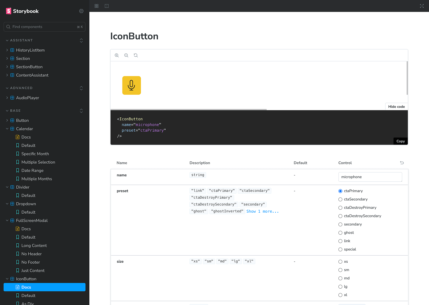
Implementation & Collaboration
Worked hand-in-hand with front-end developers to sync Figma and Storybook libraries, resolve implementation gaps, and create an ongoing versioning workflow.
Adoption & Scaling
To encourage adoption across teams, I:
Hosted training sessions and workshops for designers and developers.
A centralized internal design system hub with guidelines, changelogs, and usage examples.
Established a governance model to ensure continuous improvement.
Impact & Results
The Design System significantly improved the company’s design and development processes:
Reduced visual inconsistencies across product lines
Accelerated design-to-dev handoff with documented components
Improved team collaboration through shared tools and workflows
Delivered a unified brand experience across platforms
Key Takeaways
Design systems succeed through partnership between design and engineering
Governance and iteration are critical to long-term health
Adoption matters as much as creation—training, documentation, and advocacy are essential